LOGO DESIGN
LOGO DESIGN
Understanding the Different Types of Logo Design
Choosing the right logo design for your business is one of the most important branding decisions you’ll make. But with so many different types of logos out there, how do you know which one’s right for you?
Here I’ll walk you through the main logo types, explain what makes each one unique, and help you decide which approach will work best for your brand.
Your logo is often the first thing people see when they encounter your business. It appears on your website, your signage, your social media, your packaging – everywhere. So it’s worth getting it right from the start.
There are seven main categories, each with its own strengths and ideal uses.
Wordmarks (or Logotypes)
A wordmark is exactly what it sounds like – your company name designed in a distinctive typographic style. Think Google, Coca-Cola, or FedEx. These logos are all about the font choice, letter spacing, and the unique way the text is crafted.
Wordmarks work brilliantly when:
– You have a distinctive or memorable company name
– You want to build strong name recognition
– Your business name is relatively short and punchy
The challenge with wordmarks is that they rely heavily on typography to make an impact. This means the font choice and execution needs to be spot on. A poorly designed wordmark can look generic and forgettable.
Lettermarks (or Monogram Logos)
If your business name is a bit of a mouthful, a lettermark might be the answer. These logos use initials or abbreviations rather than the full company name. HBO, IBM, and NASA all use this approach effectively.
Lettermarks are particularly useful for:
– Companies with long names that don’t abbreviate well
– Businesses that are commonly known by their initials
– Creating a clean, minimal identity that’s easy to apply across different formats
The key is making sure people actually know what your initials stand for, especially when you’re starting out. You might need to pair your lettermark with the full company name until you’ve built up recognition.
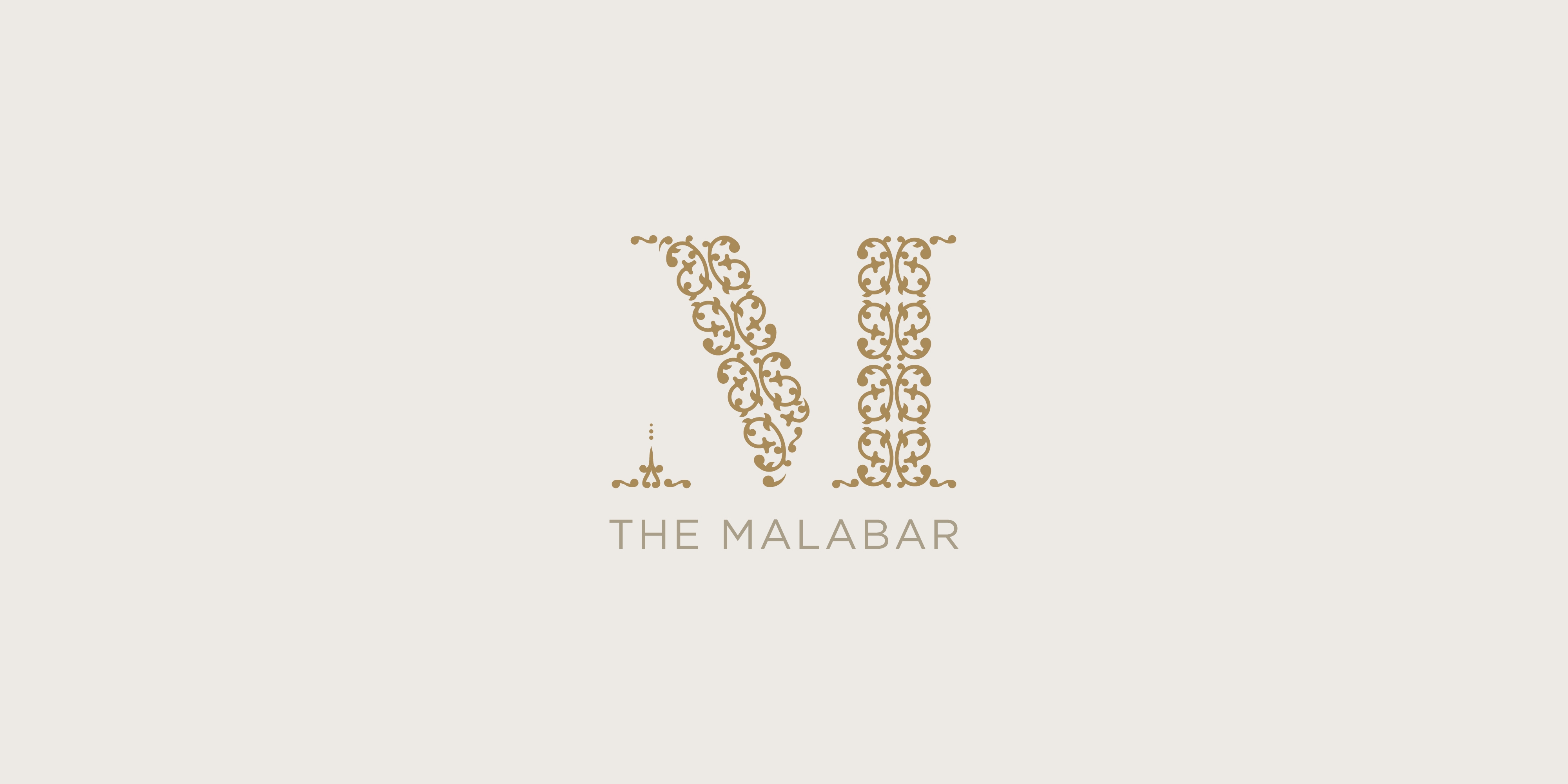
Brandmarks (or Pictorial Marks)
This is what most people picture when they think of a logo – an iconic image or symbol. Apple’s apple, Twitter’s bird (now X, but you get the idea), and the Mercedes-Benz star are all brandmarks.
These logos work well when:
– You want to create a strong visual association
– The symbol can communicate something meaningful about your brand
– You’re aiming for instant recognition
The challenge is creating a symbol that’s simple enough to be memorable but distinctive enough to stand out. It takes skill to design an icon that really captures what your business is about while remaining timeless.
Abstract Marks
This is what most people picture when they think of a logo – an iconic image or symbol. Apple’s apple, Twitter’s bird (now X, but you get the idea), and the Mercedes-Benz star are all brandmarks.
These logos work well when:
– You want to create a strong visual association
– The symbol can communicate something meaningful about your brand
– You’re aiming for instant recognition
The challenge is creating a symbol that’s simple enough to be memorable but distinctive enough to stand out. It takes skill to design an icon that really captures what your business is about while remaining timeless.
Mascots
Mascot logos feature an illustrated character that becomes the spokesperson for your brand. Think of the Michelin Man, KFC’s Colonel Sanders, or the Pringles gentleman.
These work particularly well for:
– Brands targeting families or children
– Businesses wanting to create a friendly, approachable identity
– Companies that attend events and want a physical presence
Mascots can create a real emotional connection with your audience. They’re personable and fun. The downside is they can be quite detailed, which sometimes makes them tricky to reproduce at small sizes.
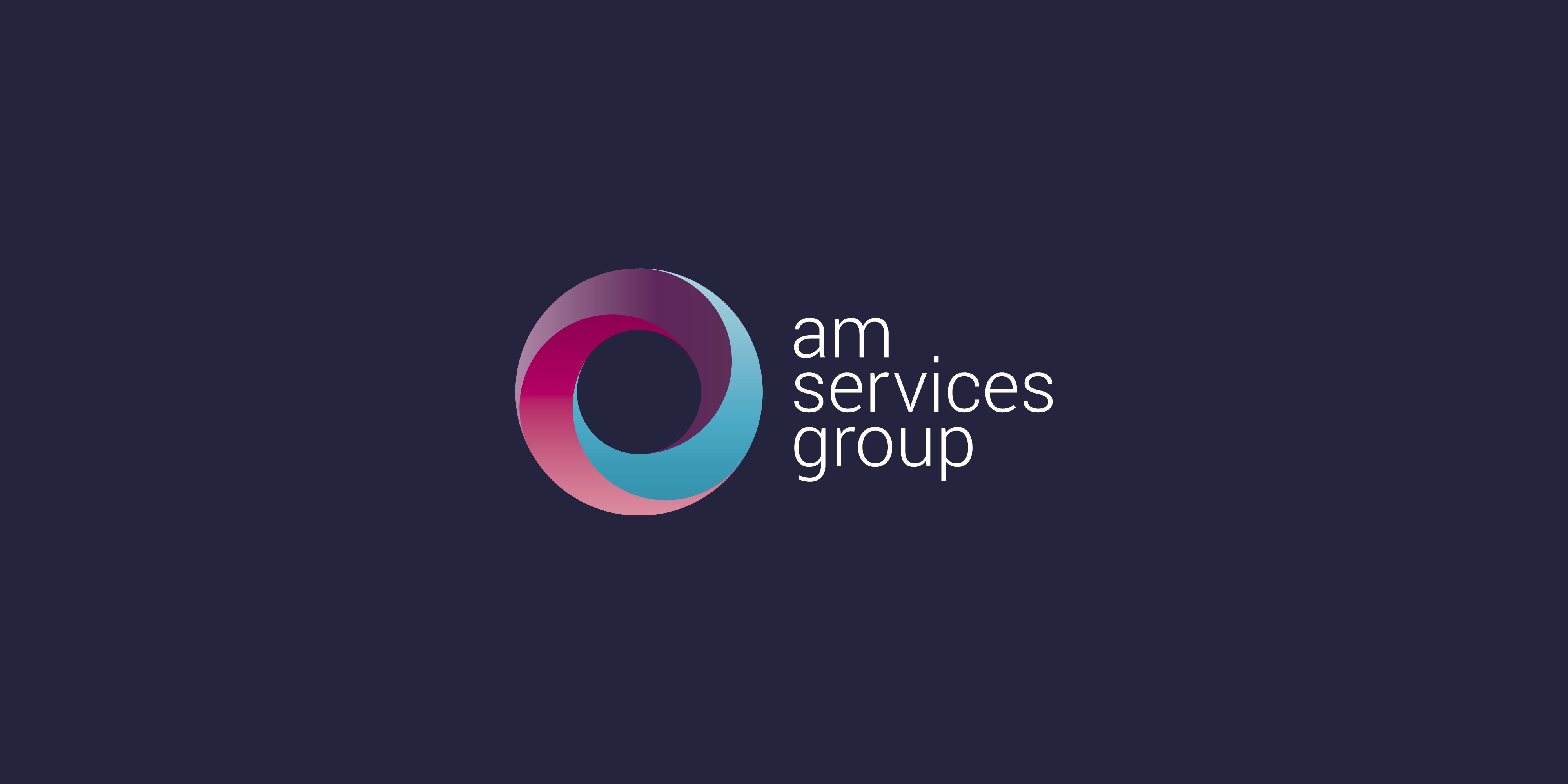
Combination Marks
As the name suggests, combination marks blend text with a symbol or icon. They give you the best of both worlds – the visual impact of an image with the clarity of your company name. Doritos, Burger King, and Lacoste all use this approach.
Combination marks are incredibly versatile because:
– They work well whether you’re just starting out or well-established
– You can use the elements together or separately once you’re recognised
– They’re flexible across different applications and sizes
This is often the safest route for businesses that want a professional, comprehensive identity from day one.
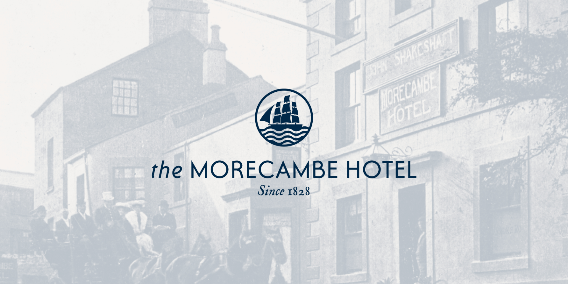
Emblems
Emblems are more traditional in style, with text contained within a symbol or icon. Think of university crests, car badges like BMW or Volkswagen, or the Starbucks logo.
Emblems are ideal for:
– Creating a classic, established feel
– Organisations with heritage or tradition
– Businesses in certain sectors like brewing, education, or automotive
The main consideration with emblems is they can be quite detailed and intricate, which sometimes means they don’t scale down as effectively as simpler logo types. They can also feel a bit formal or old-fashioned if that’s not the vibe you’re going for.
So which type is right for your business?
There’s no single “best” type of logo. The right choice depends on your business, your industry, your values, and how you want to be perceived.
Ask yourself these questions:
– Do you have a distinctive company name worth showcasing?
– Are you a startup building recognition, or an established business with brand equity?
– Where will your logo appear most often?
– What feeling or message do you want to convey?
– How does your logo need to work across different applications – from tiny social media icons to large signage?
Often, the answer becomes clearer once you start exploring what feels right for your brand. And remember, your logo isn’t set in stone forever. Many successful brands evolve their logos over time as their business grows and changes.
If you’re thinking about creating a new logo or updating your existing one, I can help you explore which approach will work best for your business.